Small design change, big impact
A thing that sometimes is said in product is: just changing the colour of a button without changing it’s function won’t drive meaningful numbers.
I don’t agree with that sentiment and this project shows it.

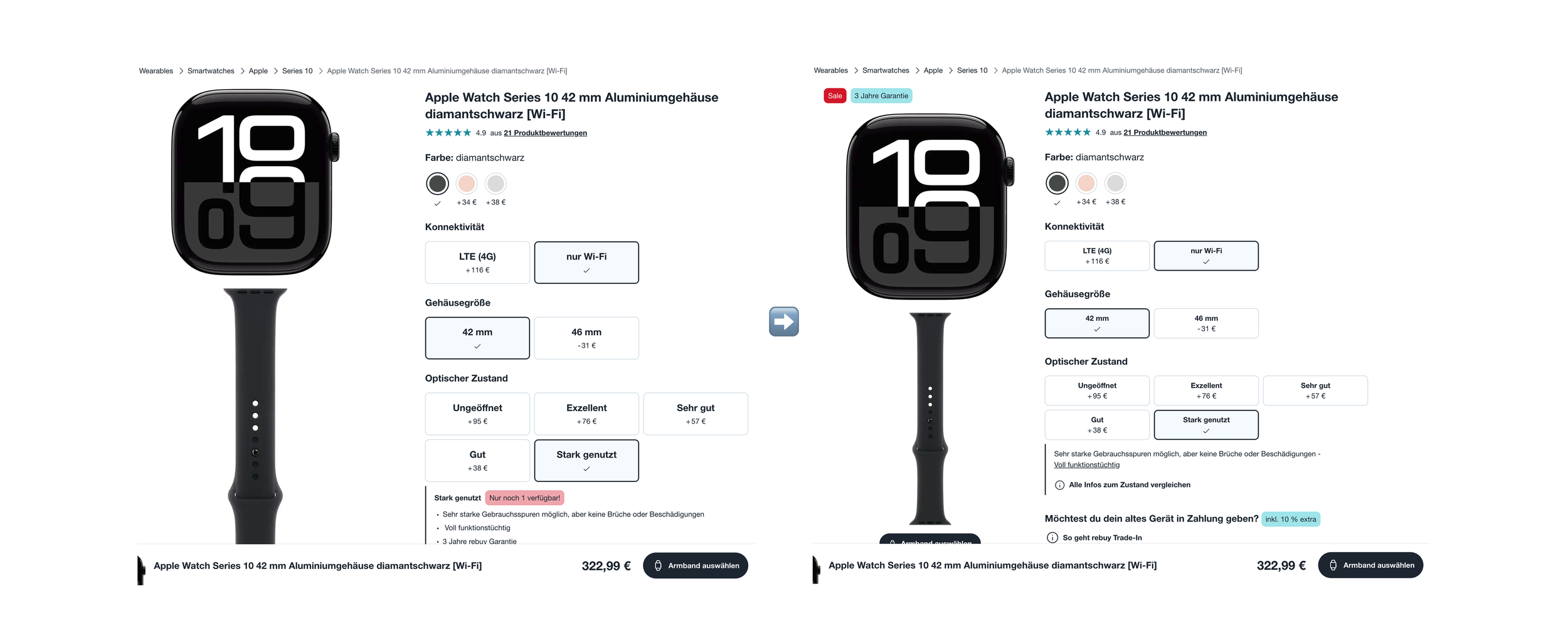
PDP decluttering
When no one “owns” certain pages/area’s in the product, it can easily happen that certain key places get overcrowded and aren’t looked at holistically. This was true of the product detail page (PDP). Teams just kept adding more and more content or features without removing/changing stuff. That has a limit.
Start with why
We noticed that PMs wanted to test out even more things on the PDP to potentially add things there. So before that happens I undertook a project to rethink the PDP a bit by cutting out things, deprioritising things, or making things slimmer.
I've asked stakeholders what elements on the PDP they found most important. I added user and business value and ranked those scores together resulting in a table. That served as a priority guide for the PDP for the future.
After redesigning it with small visual changes my staff product designer implemented it in production with a do no harm test. I just wanted a PDP that was less cluttered and clearer rules on what goes where. But I didn’t really expect that the results would be so positive.
Results:
Unique add to cart (non-smartphone) +3,86%
Unique transactions consumer electronics only (non-smartphone) +1.26%
Uniques of click more variant-info product page blue +6,09%
It feels good when you as a designer see something looks better and users see it the same.